
Loading...
Loading...
How do Groww users think?
Published
December, 2022
Role
Product Designer
'Junta' means a group of people. In 2022, we studied and experimented a lot on how our users behave and invest (or don't). In this case study, I go into each of these experiments and figure out what worked, and what didn't.
This is the first case study I wrote at Groww, weaving together a story around all year's learnings to the rest of the organisation.

Picture of my team
At the start of the year, we identified that about 43% of our active users have never invested. It's really peculiar that they keep coming to the app every month but never take action. There were a few hypotheses around it,
- Getting confused with so many options?
The whole idea and act of investing can be overwhelming for beginners. There's a lot riding on their decisions, and seeing so many options can make it difficult to take one. Were they getting confused after coming to the app?
- Getting lost?
We know that seasoned users develop their own sources to keep upto date with the market. They develop their routines and move swiftly through the app to get the job done. New users on the other hand are exploring things often for the first time. Were they not able to find what they're looking for?
- Investing somewhere else?
A lot of our users prefer us because they can find everything about a particular stock or fund in one place. Were these users just using the app for research and investing elsewhere?
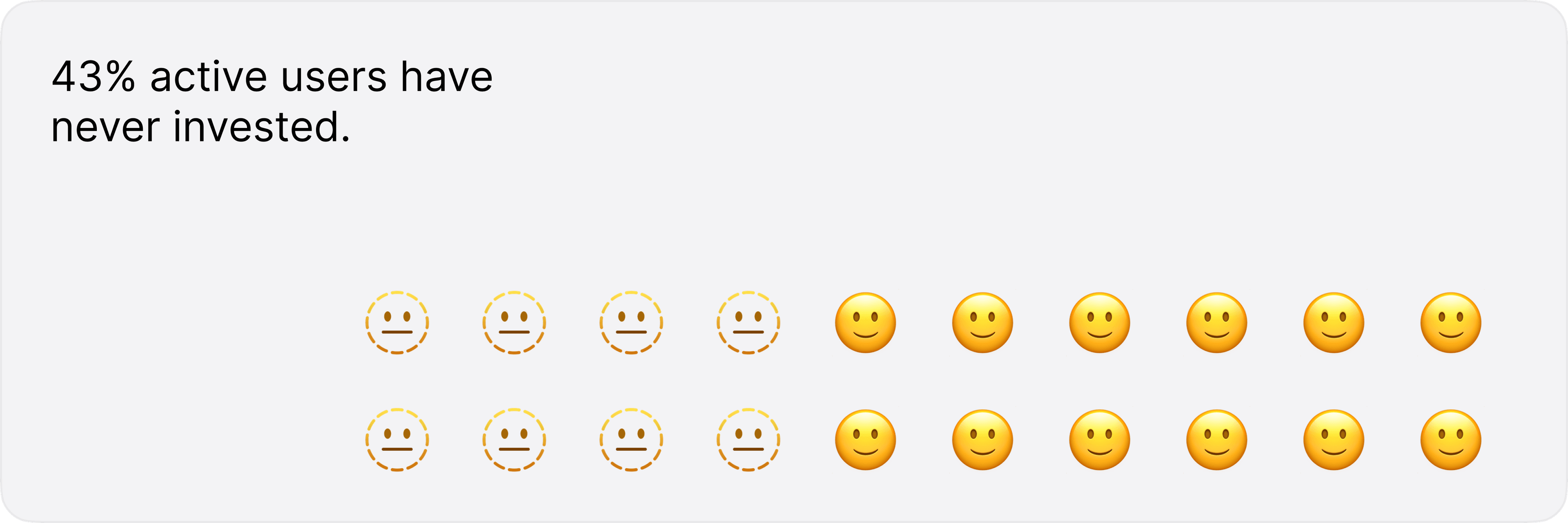
43% of Groww customers aren't investing.
We focused on two things:
Let's take a look at each of them.
When new customers come to the app to make their first investment, they see a plethora of options. But, there's just so many metrics to compare, slight fear around their 'timing' and the market sentiment, reviews to check. Let's also not forget that most of them have a lot riding on these decisions. Obviously, they get confused.
The first-time journey for a user is also not specifically tailored, they see what seasoned investors see. How can we make their life easier? There's two ways:
What if we did both?
We designed a super immersive first-time experience for users. This would be the first screen they see when they come to the app and they only had to decide between two 'actions', both familiar to them.
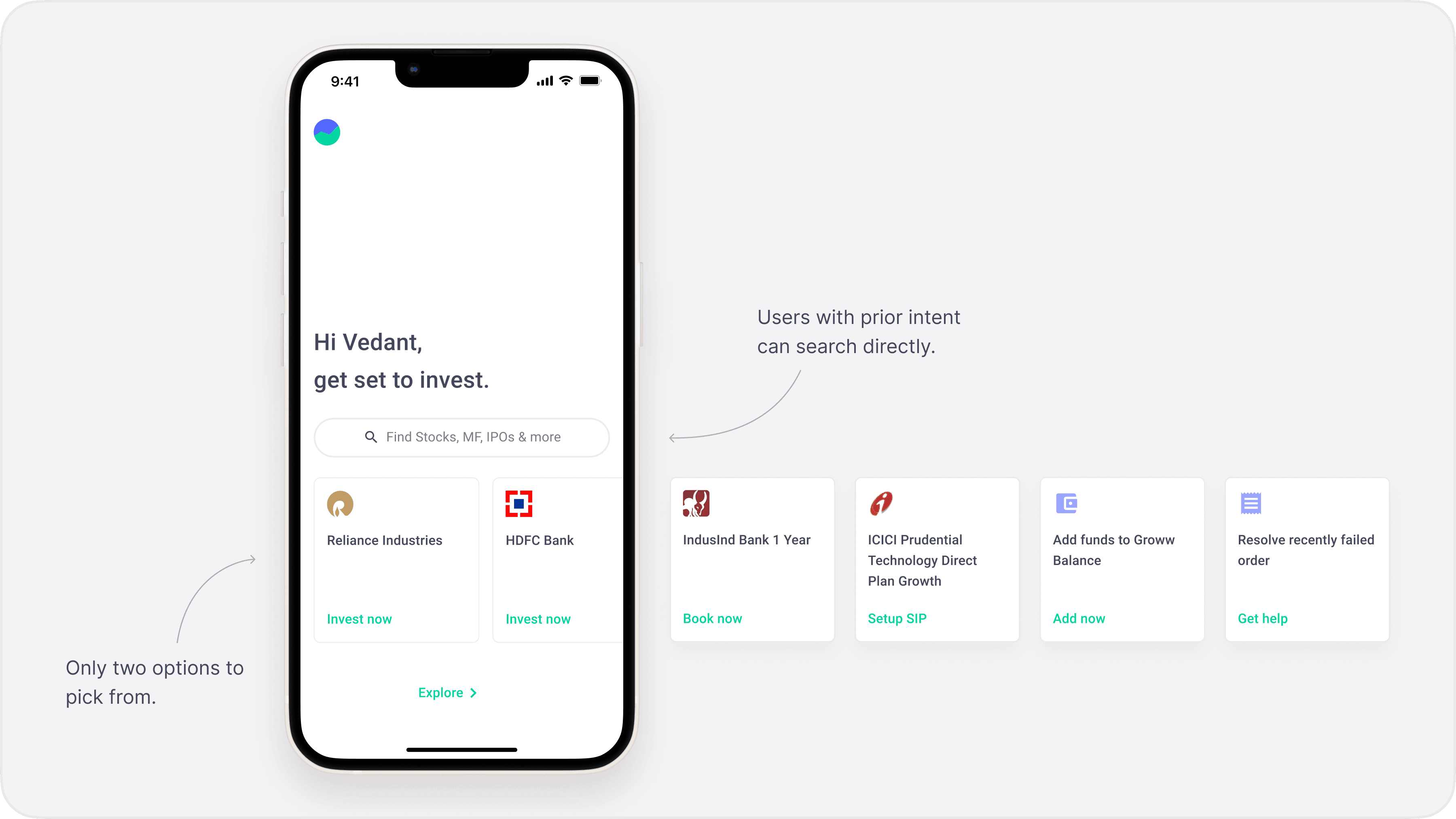
Focused experience design
With this, we can help new users complete the next immediate step in their investing journey.
In this way, they don't have to think about the next step, we're presenting it to them.
Naturally, some users would already know where they want to go, so there needed to be an easy way out of it. Both Search and the Explore were exits.
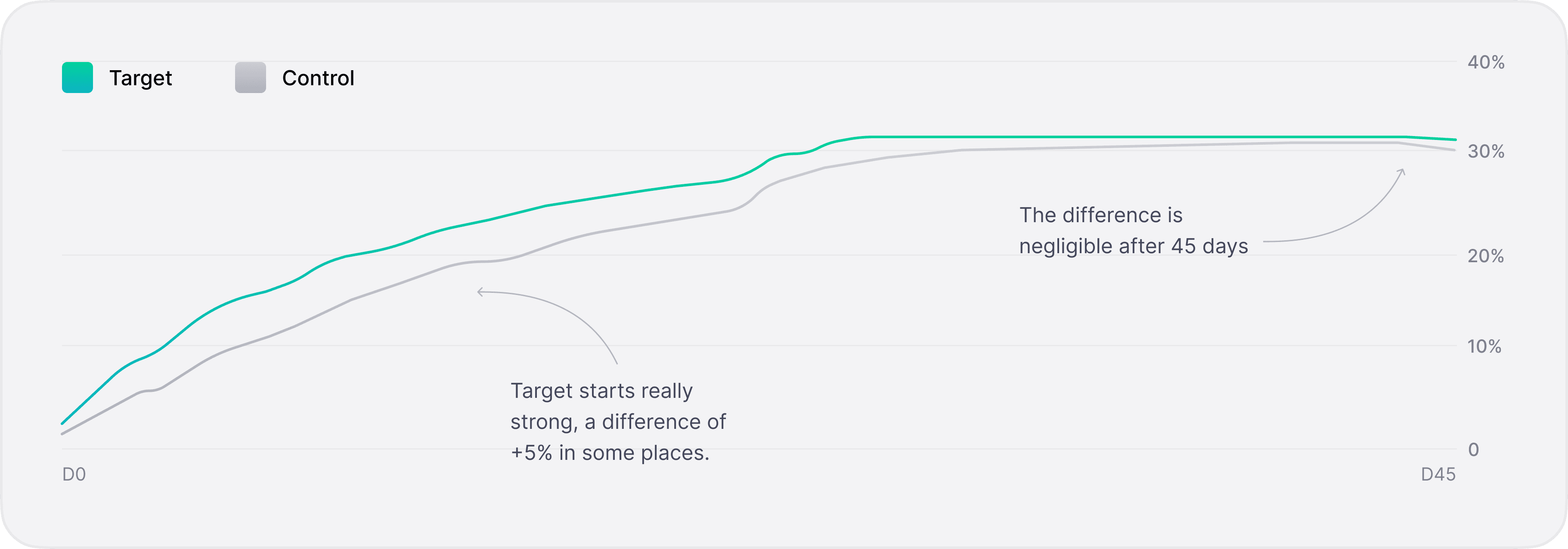
We experimented with two target groups.
Control were users who had never invested.
Now, naturally if you compare having a full-page "ad" vs not having one, former will perform better. That's the obvious conclusion from this experiment.
But the interesting thing is the difference between the groups in terms of conversion.
This is contrary to one of our assumptions earlier, that tailored options will make it easier to take decisions.
Regardless of what we showed the user, focus is what made the difference. The content doesn't matter as much as the focus we create around it.
When people come to the platform, naturally, they will look for things in the way they think. Search, right now, gets about 3.2M queries on market days. But as of July, 23% (736k queries) of them went unanswered.
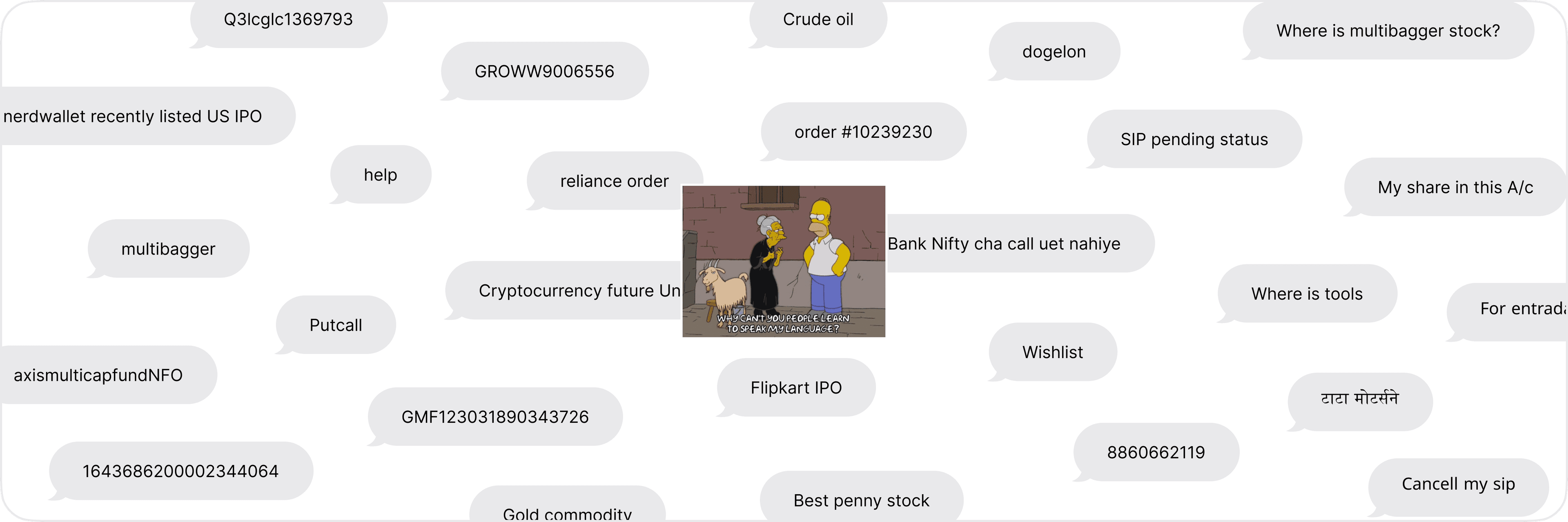
Common queries on Groww Search
When we looked into some of these unanswered queries, we found that people were using really local, junta parlance like 'where is multibagger,' or 'for entraday trade.' Sometimes, they expected Search to be able to do things which we hadn't built, like 'cancel my sip' or searching with order IDs.
This is because our Search pill resembles Google's, a LOT. It's close enough that people also expect it to behave in similar ways.
Feature search
For our Search to be truly global, we need to able to understand the user, not just instrument names.
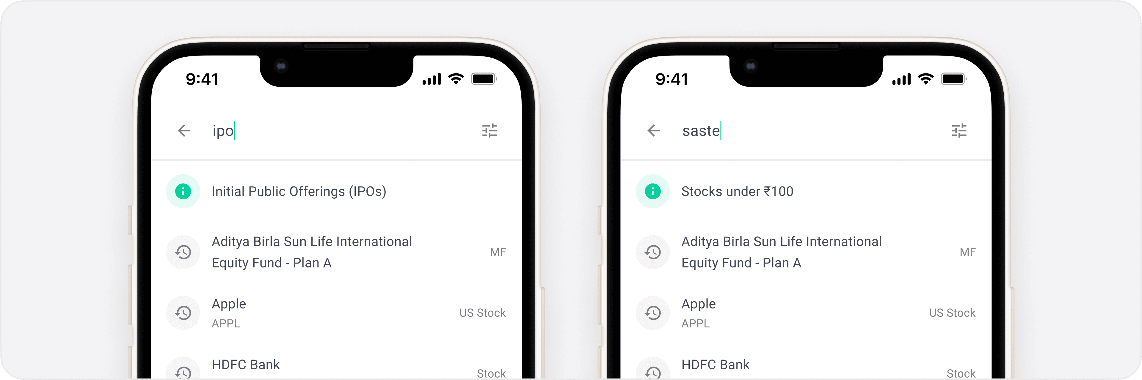
Feature search is basically a list of features a user can search for. Think of it as a Spotlight lite. Users are able to search for things like their bank details, orders, even our FAQs. On similar lines, sometimes people want to look up collections, like healthcare stocks.
Search now also understands semantics behind some words. Like 'saste...' automatically brings up a list of stocks under ₹100. Or, when users search 'urgent' or 'helpline, ' a suggestion directing the user to Help & Support pops up.
Launch week, we got 122k hits on feature searches and about 55k on semantic searches. Just in the last 5 days, it helped users reach Help & Support 20k times.
People expect things to behave the way they look. If your car looks like a race car, it's expected to be fast.
With Feature Search, we are still working with things people are feeding into it. It's a reactive approach to help people find things. What about the users who don't even know where to start or what to search for? We need to be a little more proactive and help them discover new things.
A lot of new customers, looking to make their first investment also look for some curated lists, some kind of direction or recommendations. We already know, for most Indians, their first investment is a recommendation from family or friends.
What if Groww was that friend who helped them
A nudge is exactly that. It sits at the end of the page and always has a new idea/shortcut for the user. Once users learned about it, they'd go back to it whenever they wanted ideas.
Nudges
We did a number of experiments, testing for both upsell and cross-sell with different kinds of users.
Cross-sells
Upsells
Control were users who had never invested.
Experimental nudges
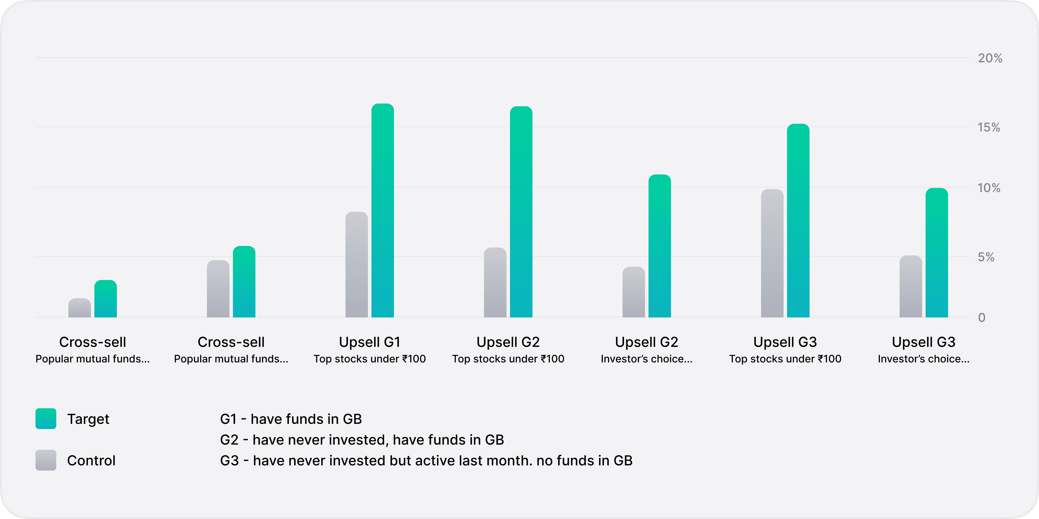
Experiment results - successful in all cases
If a user bought an instrument from the list within two days of seeing the nudge, it counted towards the nudge. It's entirely possible that they took an action immediately, or the nudge just planted an idea and they took action later.
Nudges consistently performed better than control, on varying levels.
Evidently, cross-selling didn't click with the users as much as upsells. It's natural, because if a user is scrolling through the entire Stocks Explore, they're really just interested in that.
But the interesting thing is that just viewing a list made to look personal, created enough conviction for most users. For some, it helped them diverge into new products just enough that they could take action within a day or two.
Proactive curation works. Giving these users an idea or a direction and helping these users discover new products was enough, they took action on their own.
There may have been a slight selection bias here, since users who scroll through the entire page and discover the nudge are also just more active users, so more likely to invest.
Now, let's move ahead in the investor journey. What are seasoned investors upto on the app? When we look into how our orders are distributed on the platform, it seems like discovery is mostly happening through external channels.
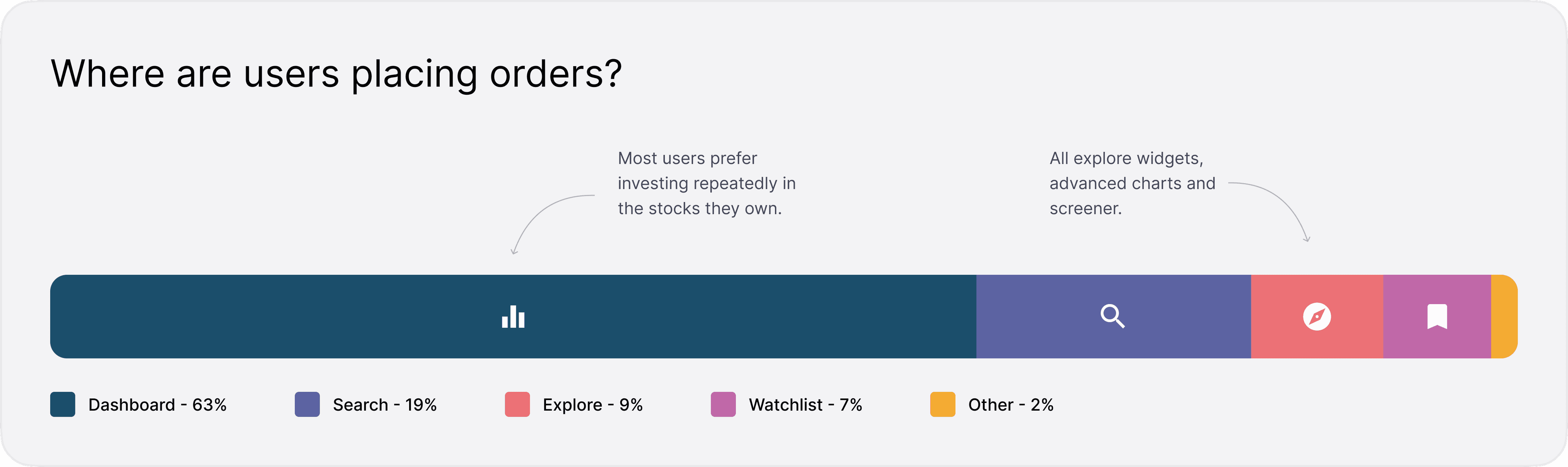
Distribution of where users place orders on Groww
That's not a surprise, we've seen the same in most of our research calls. People follow the market through their favourite news sources like Moneycontrol or Telegram groups.
Clearly, a lot of people are coming to the app with a strong intent already. They are either reinvesting in stocks already in portfolios, or invest in familiar stocks. Dashboard and watchlist are obvious ways to follow familiar stocks, but interestingly, so is search history. 60% of times, users get to their destination through search without even typing anything! They just cycle through the same handful of instruments in their search history, essentially using it as a watchlist.
People have their favourite instruments, they cycle through them repeatedly.
Since customers develop favourites as they mature, they also stop exploring. On Groww, 66% users invest only in one product. Stocks (CNC) being the most popular, obviously.
This is really concerning because (12-month) retention on the platform is directly related to the number of products a user invests in, and the jump from 1 → 2 is massive.
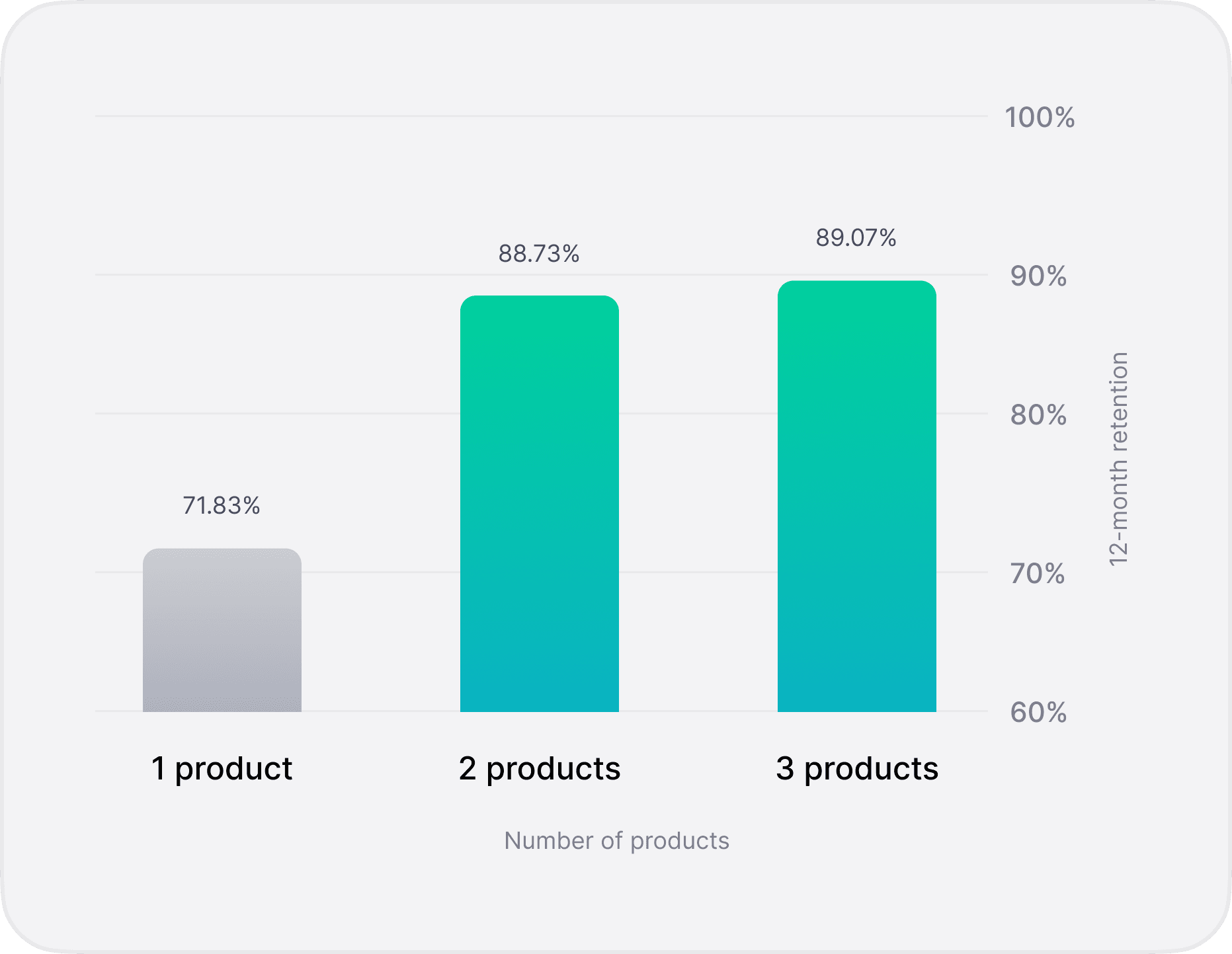
Retention increases significantly for customers who invest in multiple products
Naturally, as we keep getting new products on the app, they need to have the appropriate visibility and discovery, depending on how important it is to the user. We can't just dump all products at the same level and let the user decide.
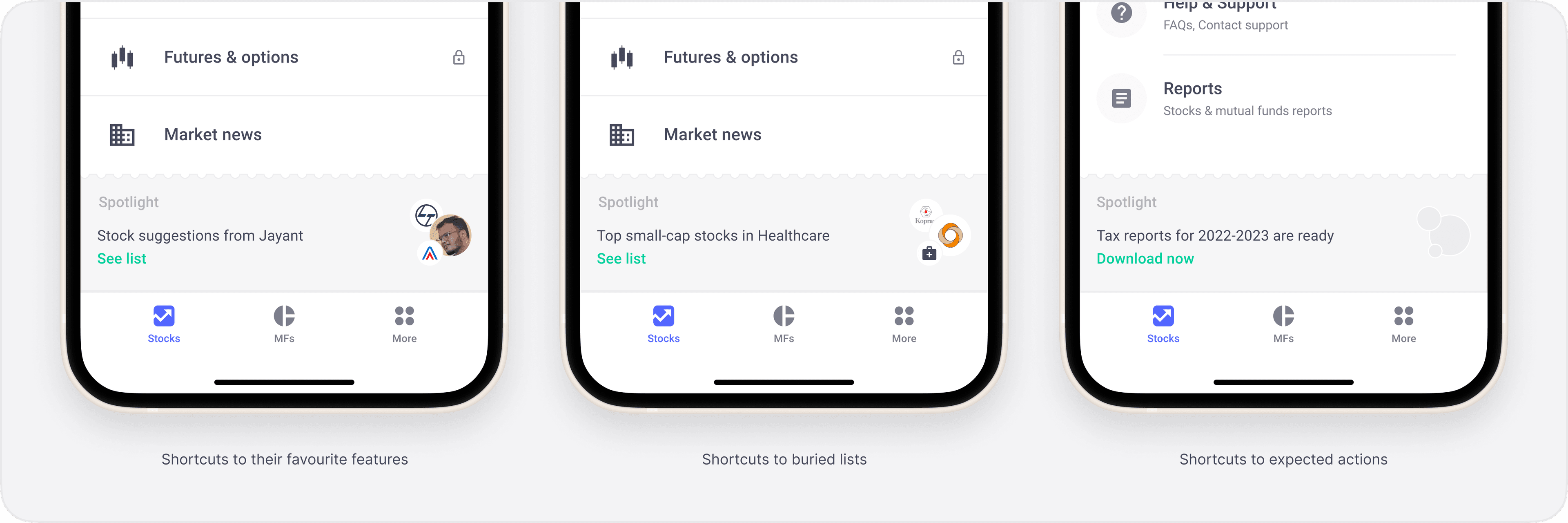
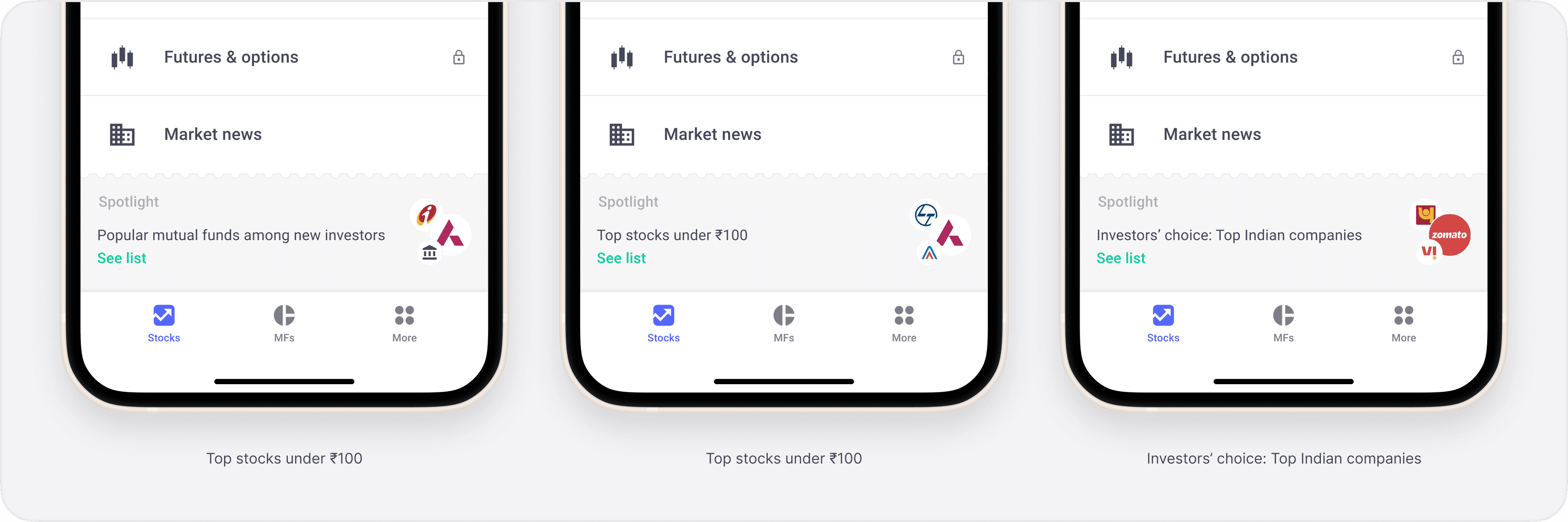
The problem lies in conveying to the user that something new has been added to the app. New additions happening inside the More tab were hidden and most customers don't go out of their way to check that tab everyday, since it's never even remotely related to their usual jobs to be done on the platform.
To nudge users into visiting this More tab, we did a two-fold experiment.
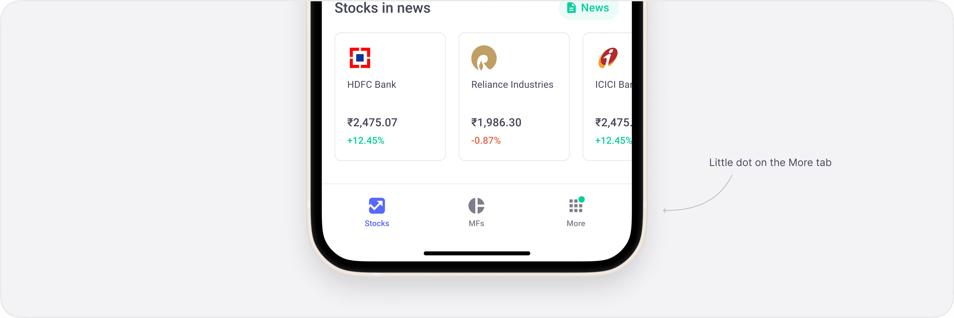
Green notification dot on More tab
There's not much to explain here, we literally just added a dot. This is a well-known "growth hack" at this point, so obviously, we expected positive results.
No surprises here, we saw a huge jump in numbers everywhere.
Now, although adding a dot is a super obvious hack, it's still a good tool to indicate there's something new. Other teams have also tried it and it works, consistently. I think the key insight from the first part of the experiment is that
Users need a subtle nudge to explore new options. Just the right placement is not enough.
Second part of this experiment was making the cards more useful and exciting. Here's where things get really interesting.
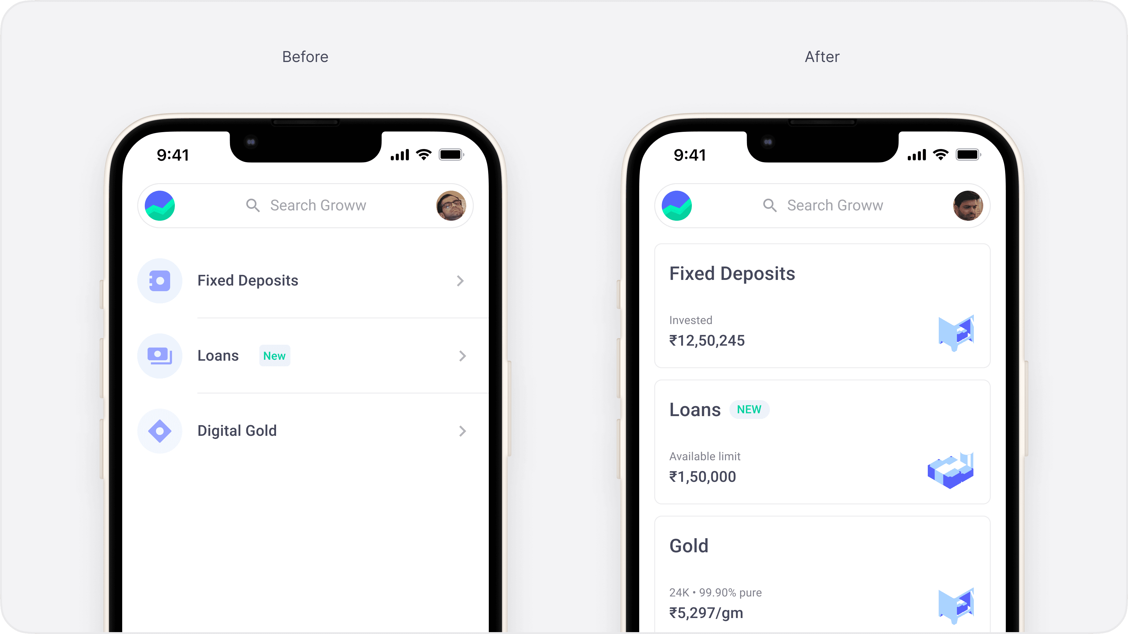
More tab changed from a basic list to flashy and dynamic cards
We tested on 3 target groups:
Control was rest of the world.
No significant improvement
For all of these target groups, we didn't see any improvement in conversion. In fact, for Explorers, the clicks on products declined by a couple points.
The new design performed considerably better than the first when it was rolled out, but both target and control plateaued at about the same place.
This was the exact opposite of what we expected. So, I guess the insight here is that flashy designs may work on the short-term, but users don't care. Keep it simple.
We really just did a reverse Picasso here
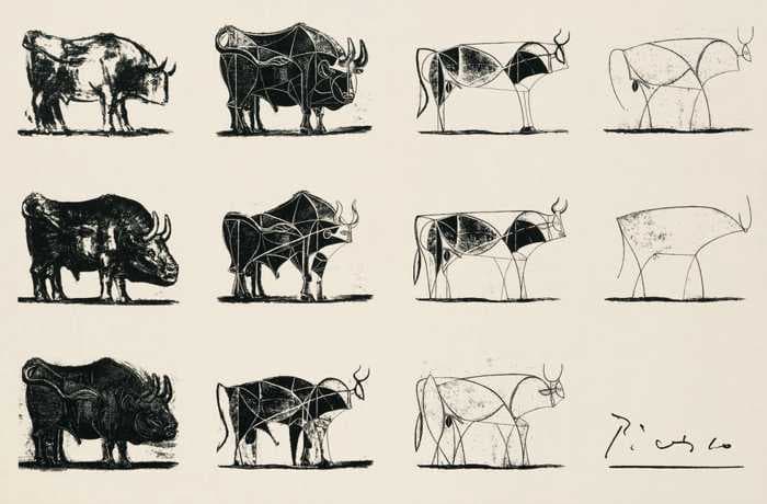
Picasso's bull painting
In 2022, we experimented a lot on how our users discover things and take decisions. Here's the three key insights we learnt, which you can start applying to your projects today!
Thanks for reading!